-
8 October 2021
- Data Pipeline
We are all facing huge datasets of raw data coming from multiple sources. Often it is necessary to “clean” them by applying specific rules patterns of dates, timestamps etc. to each type of data. Data exploration is a process that will help your experts to learn more about business information you gather all the time and use it more efficiently.
In short term, data exploration is pruning of data to remove unusable parts and identify potential relationships between different types of data. We can achieve those both manual or automatic way with the exploration techniques and data analysis examples described below – which will let our data become a gold mine of information.
Why is Data Exploration important?
Data exploration enables deeper understanding of gathered datasets, but there is more to it than that. By getting to know their data better, data analysts also become more efficient in navigating through the data and using them in the future. It is also a practical process to perform in order to narrow down datasets to a manageable size, optimize your analysis.
Data Exploration step by step
It is most important to understand that high quality of input data is crucial for achieving a good quality of output before getting to the actual data exploration process. Before you start dataset exploration, perform data cleaning as well as normalization (for example you have sensor data gathered around the globe but provided values are in different scales of temperature, metrics, etc.). Prerequisite steps will be crucial when starting actual data analysis to produce reliable business insights.
At the beginning we need to identify input and output type, categories and variables which have to be clearly defined.
Next step of data exploration will be related to specific exploration of each variable. Methods used for such analysis can be decided based on type of variables — categorical or continuous.
For categorical variables, a frequency table representing percentage of values by count and count% metrics needs to be used to understand each category distribution.
With the continuous variables, we need to understand spread and central tendency. Dispersion might be checked through range, quartile, standard deviation, variance etc. while for central tendency we will use mostly min, max, mean, median, etc. Usually we can easily take our observations with visualization methods like histograms or plots. Data visualization tools can be useful during data exploration and help you find significant relationships or anomalies in datasets.
Relationships between different variables have to be analysed as well. Association and disassociation between predefined variables are considered in the following combinations:
- Categorical and continuous: box plots for each categorical variable to be drawn.
- Continuous and continuous: linear or nonlinear relationship will be defined by conducting analysis between two continuous variables with scatter plot of categorical variable.
- Categorical and categorical: easiest way to achieve some insights will be using a two-way table or stacked column chart.
Data Exploration techniques
There are multiple data exploration techniques, your data analysts use in order to learn more about your company’s datasets. Depending on the data type, some of them might be more or less accurate to choose. Defining which technique will best suit and be most helpful to retrieve valuable information from the dataset is crucial before getting to actual Data Exploration. Here are some examples which might help in the final decision.
- Unique value count
It’s a first thing which can be useful during exploration, showing how many unique values are included per categorical column. This will give us a general idea of what the data is about.
 Fig 1. Shows unique names count across specific state in US
- Frequent value count
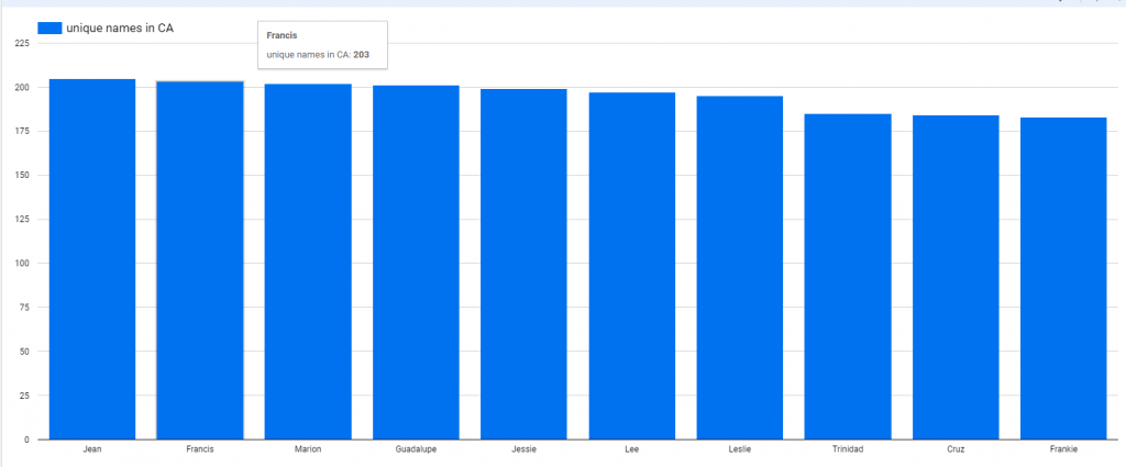
Detecting how frequently individual values occur in a specific column. This will give an insight into the content of each categorical variable.
 Fig 2. Shows unique names count across CA
- Variance
For numeric values we have plenty of easy ways to get some basic information like minimum, maximum, or variance are very useful. Variance gives a good indication about spread of the values across specific variable.
- Pareto analysis
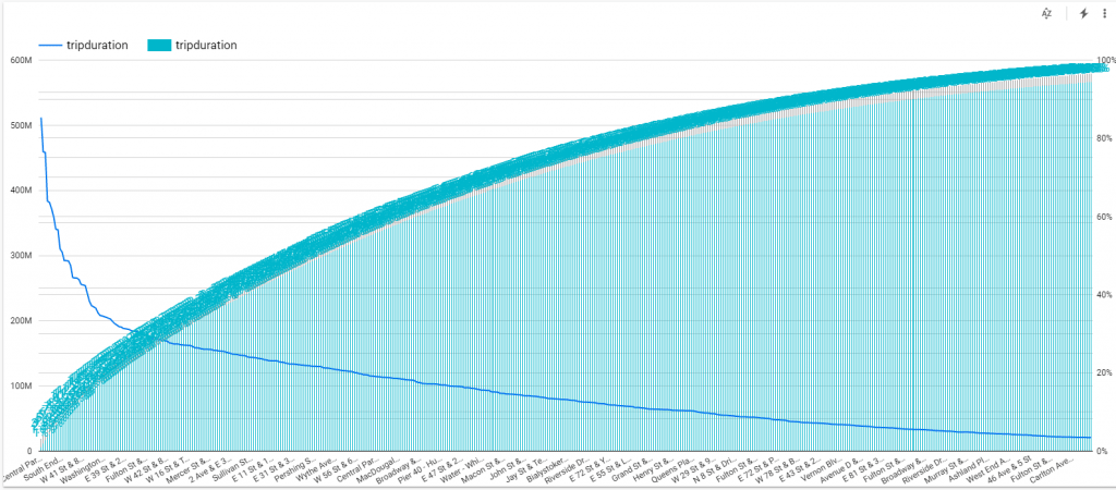
This data exploration technique allows you to focus on what is really important. 80-20 pareto rule can effectively show the level where we are observing significant meaning of specific value.
 Fig 3. Shows bike trip duration depending from starting station
- Histogram
Gives information about the range of values falling in the majority sector. It indicates any skew data as well as minimum and maximum ones.
- Correlation heat-map
Correlation basically means association between two things. It is useful to express relationships between different columns in data. One of the best ways to see correlation between numeric columns is heat-map. Correlation, however, might be useful with various types of data.
 Fig 4. Shows bike trip duration depending from ending station and user birth date
- Pearson correlation and trends
Another interesting data exploration technique is looking for Pearson correlation and trends. Once we have a heat-map, we can use it to see the correlation trend between two numeric columns.
- Cramer-V correlation
Cramer-V is a data exploration technique providing correlation between all categorical variables. The result can be visualized as well with heat-map.
- Categorical columns pair correlation
Once we have checked correlation between categorical variables with the Cramer-V matrix, further exploration can focus on specific pairs of categorical columns. There are plenty of ways of visualization, and bubble plot can be one of them.
- Cluster size analysis
Such analysis for data exploration purposes is often adopted to check huge amounts of data, which is split into different groups/clusters before actual analysis. The first step in segmentation will be checking cluster size. Such analysis will show us how data can be split into different groups.
- Clustering or Segmentation
Once we have checked the number of clusters, we need to divide data into a specific number of clusters or segments.
- Outlier detection
Finding abnormalities during data exploration is not something we should worry about. They do not necessarily mean something negative. Such analysis helps to enhance the quality of the whole exploratory. Numeric values outliers can be found by standard deviation or algorithms like Isolation forest.
- Outlier analysis for specific numeric column
After checking minimum and maximum values for numeric columns, we can analyse individual ones.
- Outlier analysis for multiple columns
It is important to find outlier based on multiple column (at row level). The Scatter Plot will be a useful tool for such exploration. It will show outliers marked with different colour.
- Specialized visualisation
Most of the visualisations shown above are the classic ones like bar charts, plots etc. But we can use less common data exploratory tools which are specialized visualisations like radar charts for example.
It will be a great way to understand data and do the actual data exploration.
Conclusion
Data exploration is one of the key points to get some value from it. A visualised data is easier to understand and get some insights than raw mathematical numbers gathered in tables.
We are all familiar with large, unstructured volumes coming from multiple sources. Data exploration techniques are necessary to provide us with the actual value of data, which then might be processed with further analysis.
Check out our blog for more details on Data Pipeline solutions:


